


Even the smallest businesses accumulate vast amounts of data. From financial transactions to product reviews to shipping details — it all adds up to a metaphorical mountain of information.
In the U.K., 21% of businesses(opens new window) analyse digitised data to gain new insights, and this percentage will continue to rise as more companies embrace data-driven decision-making. To streamline data analysis, many businesses turn to Microsoft Power BI. This advanced business intelligence tool synthesises data from various sources and extracts actionable insights.
Despite the growing reliance on Power BI, many employees lack the knowledge to use the tool effectively. The Multiverse Skills Intelligence Report 2024 found that 55% of professionals have no Power BI skills. This skills gap can affect productivity and prevent businesses from getting the most out of their data.
Learning Power BI will help you gain in-demand data analysis skills and open new career opportunities. This guide offers an in-depth overview of Power BI, its functions, and practical steps to start using this versatile tool.
What is PowerBI?
Power BI stands for business intelligence and refers to several Microsoft products and services designed for data analytics and visualisation. It lets users gather raw data from multiple sources and turn it into interactive dashboards and reports. Professionals can use this business analytics solution to gain actionable insights from almost any data type and make strategic decisions.
Say, for instance, a retailer sells perishable products and wants to reduce the amount of waste. They can use Power BI to analyse current stock levels, customer preferences, and sales trends. The platform helps identify slow-moving products and forecast demand. Based on these insights, the retailer can optimise its inventory orders to minimise waste while meeting customer needs.
Power BI is a suite of business intelligence solutions that allows users to analyse data and share reports across devices. This comprehensive solution is comprised of several visualisation products and services, including:
- Microsoft Power BI Desktop - Install this free Windows application on your computer to create data models, visualisations, and reports. It enables you to connect to multiple data sources, combine them into cohesive data models, and represent information as stylish graphics.
- Power BI Service - This cloud-based platform is designed for streamlined publication and distribution. It lets you visualise your data and share interactive dashboards and reports from your browser. You can also collaborate on reports with other Power BI users.
- Power BI Report Server - This on premises report server lets you analyse and visualise data on your local devices and network instead of the cloud. Companies often use this platform to analyse sensitive data and share insights securely.
- Power BI Mobile Apps - Microsoft offers several Power BI apps for IOS and Android devices. These apps allow users to connect to data and view dashboards and reports from mobile devices.
Core features of Power BI
Power BI is a flexible business intelligence tool with many sophisticated capabilities and features. These functions allow Data Analysts and other professionals to perform advanced analytics and create interactive reports.
Data visualisation
Data professionals often work with complex and vast datasets. Even the most experienced Analysts may struggle to understand the connections and trends within raw data. For instance, you may wonder how to make meaning from thousands of customer reviews.
Microsoft Power BI is an accessible and convenient solution that lets you visualise your data. The platform uses data analysis and artificial intelligence (AI) tools to interpret datasets and transform them into interactive graphics.
Here are a few types of visualisations you can generate with Power BI:
- Area chart - A variation of the line chart that uses shading to reveal the magnitude of change over time
- Bubble chart - Represents data points as bubbles with different colours and sizes
- Shape map - Uses shading to compare data across regions on a map
- Smart narrative - Combines visualisations with explanatory text
- Table - Displays data in rows and columns
These data visualisations allow you to spot patterns, trends, and anomalies at a glance. You can use these tools to uncover fresh insights that frequently go unnoticed with traditional data analysis methods.
For instance, transforming customer reviews into a shape map allows you to analyse regional trends effectively. This visualisation can help you identify areas with higher and lower customer satisfaction. Based on these data driven insights, your team can develop targeted strategies to improve the customer experience in these areas.
Data visualisation also enables you to share your findings with non-technical stakeholders. These audiences typically understand colourful graphics more readily than dense spreadsheets or technical reports. Presenting data visually lets you capture their attention and communicate insights more effectively.

Integration with multiple data sources
Microsoft’s advanced integration capabilities are among the top reasons to use Power BI. You can seamlessly connect data to Power BI from hundreds of sources, including:
- Amazon Redshift
- Azure
- Excel
- Google BigQuery
- Salesforce
- SQL databases
These integrations let you access data from external sources without converting it to another format or writing complex queries. Additionally, these connections enable you to synthesise and analyse data from multiple platforms to answer complex research questions.
For example, you could combine Google Analytics and Salesforce data to understand how your marketing efforts affect web traffic. This integration lets you determine which marketing campaigns drive the most visitors to your website, deepening your understanding of customer behaviour.
Real-time analytics
Microsoft Power BI enables real-time data streaming and analytics through interactive dashboards. Users can choose from several real-time semantic models, including:
- Push semantic model - Power BI automatically creates a new database to store real-time data as it gets pushed to the platform. This is the only model that lets users create reports and visualisations with the data.
- Streaming semantic model - Power BI stores the data in a temporary cache instead of building a database.
- PubNub streaming semantic model - Power BI reads an existing data stream from PubNub without storing data.
These models let businesses gain real-time insights from Power BI dashboards and make faster decisions. Organisations can analyse a wide range of real-time data, such as sensor readings and sales transactions. For instance, a factory could monitor manufacturing equipment sensors in real-time to detect anomalies and identify machines that need preventative maintenance.
Types of reports and dashboards in Power BI
You’ll likely need to compile and share your results with business leaders, managers, and other stakeholders. Power BI’s publication and distribution capabilities make it easy to share insights across your organisation.
Power BI reports present data through dynamic visualisations. Users can interact with these graphics by clicking buttons, filtering the data, zooming in, and more. These features allow viewers to drill down into the data and gain fresh insights.
You can use Power BI to build many types of reports(opens new window), including:
- Digital marketing reports
- Financial summaries
- Key performance indicator (KPI) tracking
- Operational reports
- Sales analysis reports
- Spend analysis reports
Additionally, Power BI users can create custom dashboards for different teams and departments. Each dashboard has a single webpage that uses data visualisations — commonly known as “tiles” — to tell a cohesive story. These tiles are pinned from various reports, which viewers can access by clicking the visualisations. You can also add images, text boxes, and videos.
Dashboards are ideal for focused data analysis. They allow you to select the specific information you need to answer questions or gain insights about business operations.
For example, you could create an interactive dashboard that analyses employee productivity by tracking metrics like attendance and task completion rates. Managers could use this dashboard to gain insights into factors affecting efficiency and identify areas for improvement.

Steps to get started with Power BI as a beginner
Learning to use Microsoft Power BI may seem intimidating, especially if you don’t have extensive data analytics experience. However, this tool has many user-friendly features, so you can master the basics in just a few hours.
Download and install Power BI Desktop
Get started by installing Power BI Desktop on your computer. This free self service data analysis tool allows you to connect your data and build dynamic reports.
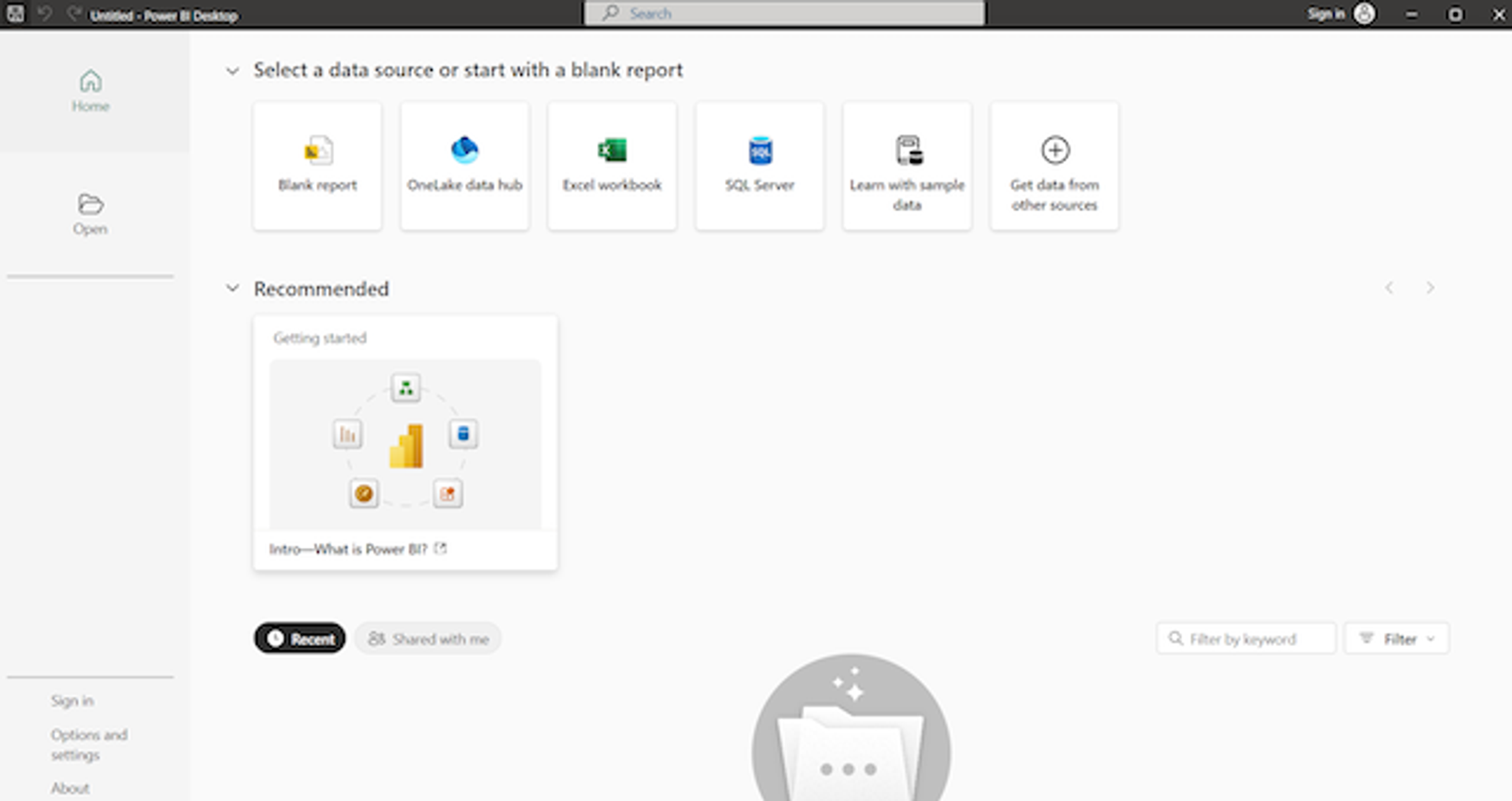
First, visit the Microsoft store or website to download Power BI Desktop(opens new window). Once the application is installed, launch it and arrive at the home page. You may want to click “Intro–What is Power BI?” to complete a 21-minute tutorial on the Microsoft website. You can also sign up for a Power BI account to access more features.
Connect your data
Microsoft Power BI Desktop users typically import data from external sources, such as cloud platforms and Excel files. Click “Get data from another source” to view all your options. For instance, you can connect data from an Access or MySQL database.
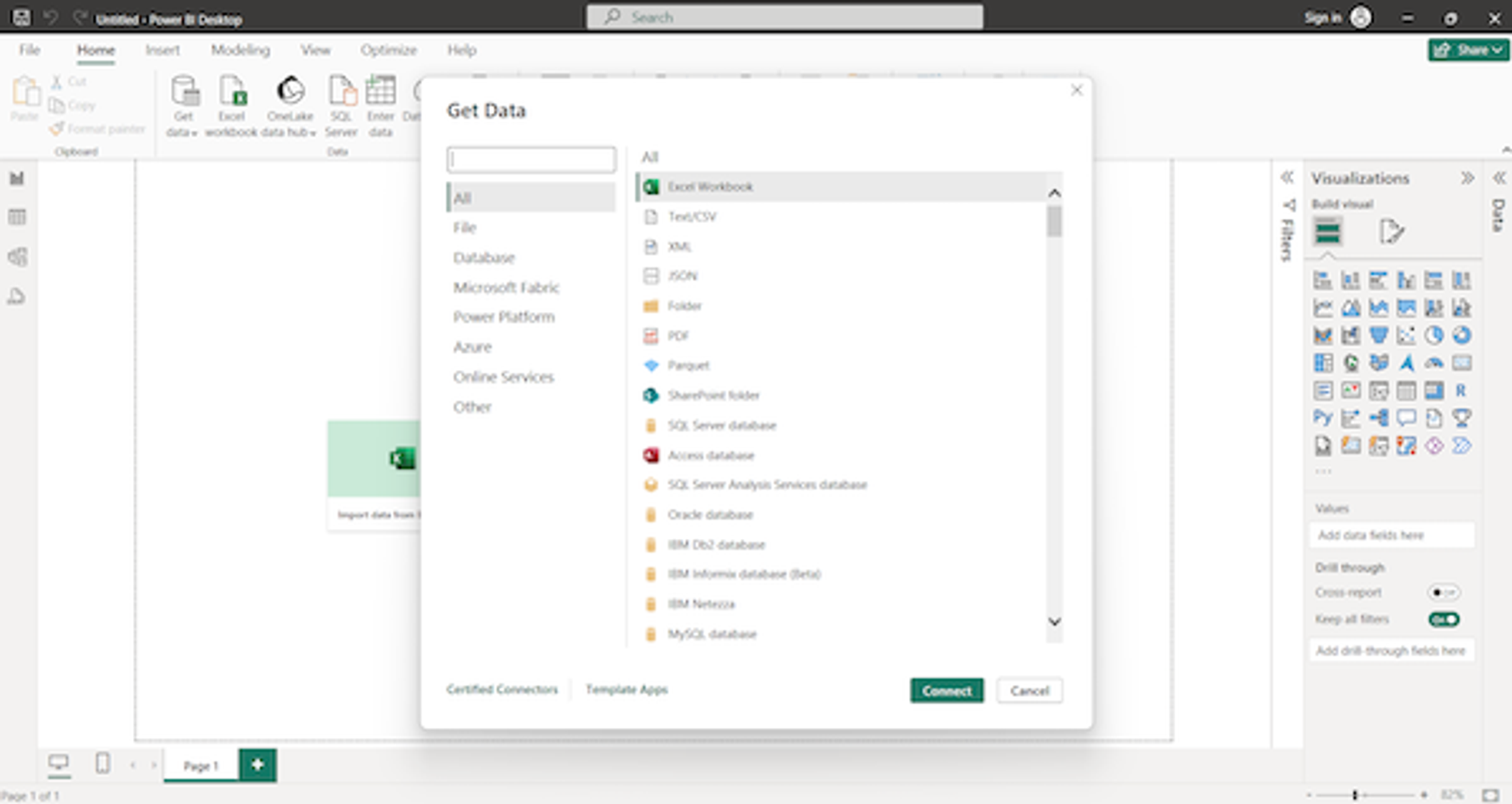
Don’t have any data ready to use? Click “Learn with sample data” to create reports and visualisations with preloaded datasets. This convenient feature lets you start building your skills immediately without gathering real data.
Create your first visualisation
Once you’ve connected a data source, you’re ready to build a visualisation. Use the Navigator pane to select the data you want to include in your visualisation and click Load.
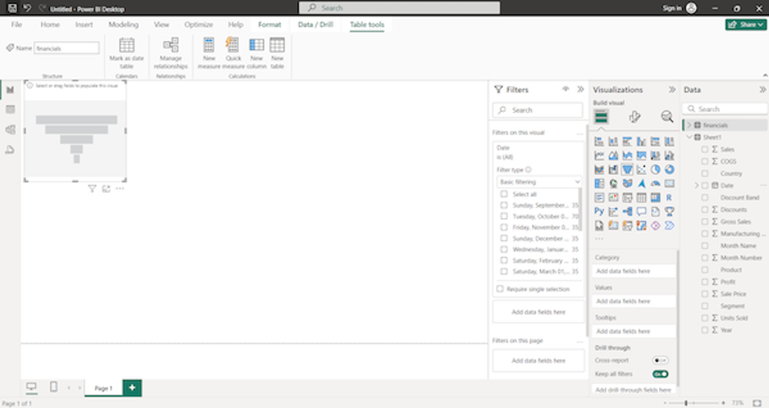
Next, select the type of visualisation you want to create and use the drag and drop interface to add fields from your data. For instance, you can create bar charts or line graphs to visualise sales trends. You can also insert buttons, explanatory text boxes, and other elements.
Explore Power BI tutorials and learning resources
Power BI has many built-in learning resources to build your confidence and skills. Click the Help tab in the top menu to access guided learning tutorials, training videos, and documentation. Additionally, this tab includes links to the Power BI blog and the Power BI forums.
These resources can help you gain more advanced skills and troubleshoot issues. For instance, you can learn how to create machine learning models, customise security features, and embed Power BI dashboards in websites.
Use cases of Power BI in industries
Here are a few reasons to use Microsoft Power BI in different industries.
Retail
Microsoft’s BI reporting and data visualisation tool has many applications in the retail world. Companies can use Power BI to track sales trends across different products and regions. These insights allow them to predict customer demand and optimise supply chains.
For example, Walmart(opens new window) uses Power BI to monitor customer preferences, inventory levels, sales, and other data. The retailer uses these insights to deliver personalised marketing and decrease stock outs, improving the overall customer experience.
Healthcare
Power BI allows healthcare organisations to analyse patient data and enhance care. For instance, INTEGRIS Health(opens new window) uses Power BI to monitor caregiver performance and reduce the risk of patient injuries. This tool also allows healthcare organisations to analyse clinical activities, employee productivity, and other metrics to improve operational performance.
Finance
Finance teams use Power BI to analyse financial data, create reports, and track KPIs. Metro Bank(opens new window) is one institution that relies on this tool extensively. The company uses Power BI to analyse online transactions, track customer complaints, and optimise staffing for peak activity times.
Master Power BI with Multiverse
Microsoft Power BI is an indispensable data analytics and reporting tool across industries. Its value and versatility comes from leveraging multiple data sources to create comprehensive reports that deliver data driven insights. Companies use this tool to analyse and improve customer service, marketing, supply chains, and other essential business functions.
While Power BI is relatively user-friendly, learning to use all its features and functions effectively takes time. Multiverse’s upskilling programs can help you learn how to navigate Power BI and leverage this tool in your career.
Multiverse offers several training programs related to Power BI, including Data Fellowship and Data & Insights for Business Decisions. These free programmes allow you to learn advanced data analytics concepts and tools. You’ll also gain hands-on experience completing real data projects for your employer, which may prepare you for more advanced roles.
Ready to join them and level up your skill set? Complete our quick application(opens new window) to get started.